CLIENT CHOSE BOTH
The client chose both campaign concepts. They kept the second visual treatment for Q3 and Q4. Giving the campaign a new look and boosting our engagement back to launch numbers.

NATIONWIDE – BANK 2 WIN
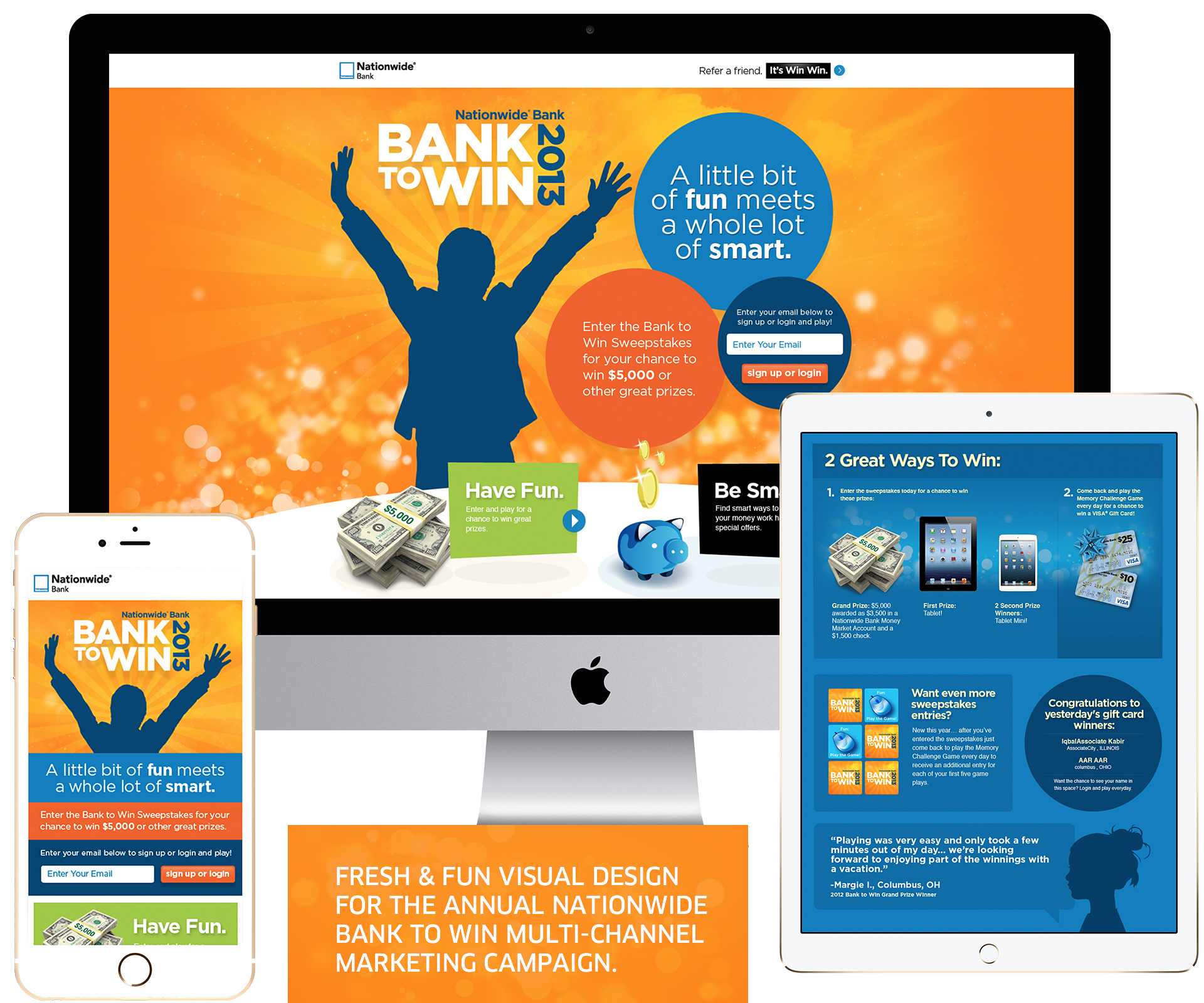
For Nationwide’s annual Bank 2 Win I was tapped to give this campaign a fresh new look. Having the same visuals for the last couple years plateaued the engagement numbers.
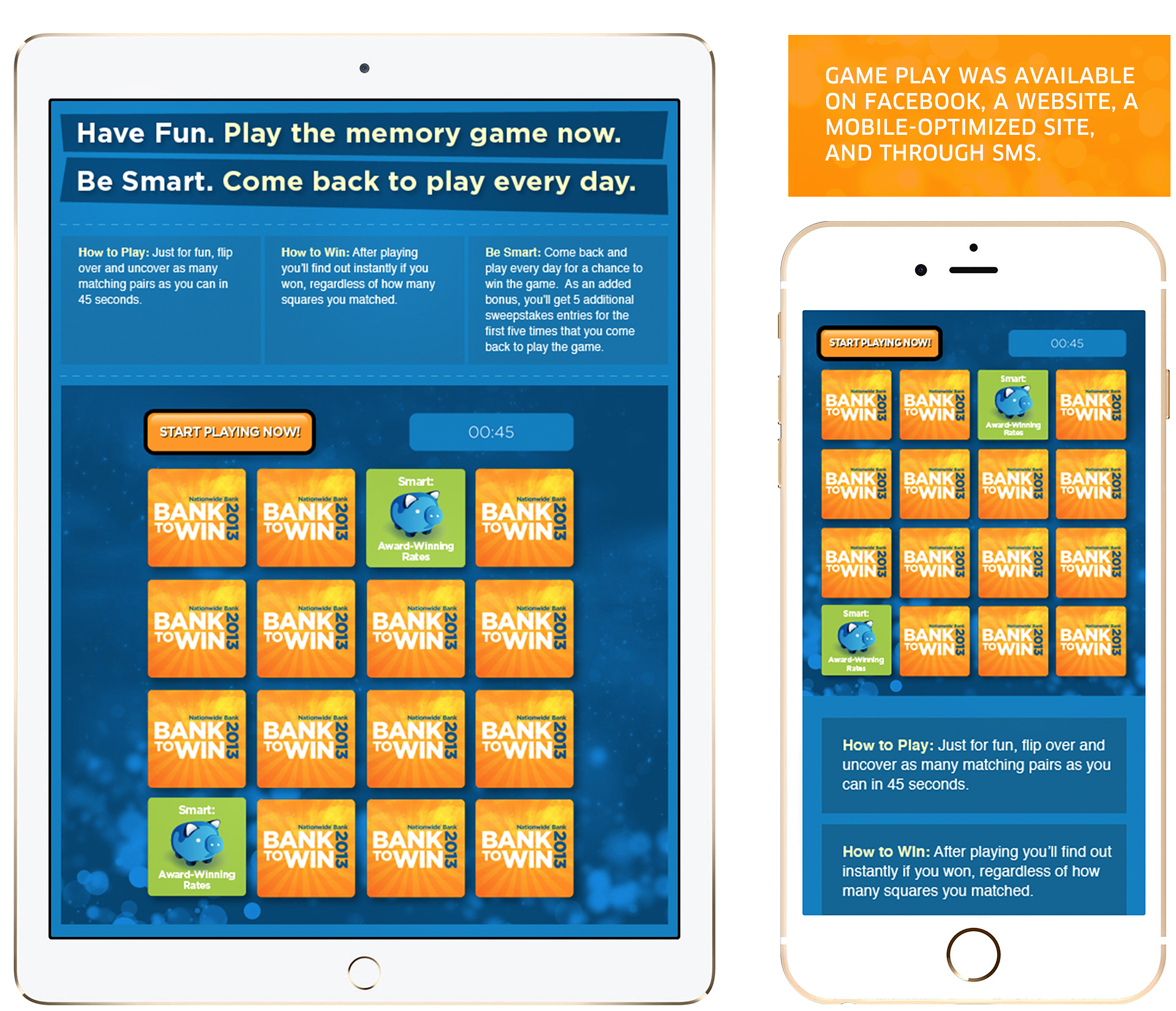
Taking a more interactive approach I designed the site as a parallax experience. The elements shift and move with the users mouse giving the campaign the excitement it needed to reengage the user base.
This Bank 2 Win campaign was their most successful to date. Boosting submissions by 65%.


